Last updated on August 9th, 2024 at 02:46 pm
 Branding yourself is an important step in launching your dream online because your brand – who you are – is an extension of your authentic self. Branding yourself online allows you to present yourself in the best possible light.
It can also make your followers feel close to you and a part of your online success.
Think of branding yourself as an online business suit and creative portfolio rolled into a giant space.
I recently purchased my own business website, and I’ve spent the better part of the last two weeks working on getting WordPress installed and figuring out a plan for the brand that will be “me” online.
I’ve had those crazy dream thoughts one has when launching a particular dream phase. At one point, I thought: What if I’m not all that brand-yummy? (I just made that word up to represent someone who exudes uber-coolness online). This translates into me thinking this is all just a grand waste of time. It’s not. We just like to make excuses when it’s time to move our dreams to the next level.
I swear to the Goddess above that working on your own stuff is more difficult than helping someone else with their dream. I think this is parallel to mechanics who hate to work on their own cars and techies who hate to network their home computers.
It’s like swimming through peanut butter.
While trying on 1,000 wedding dresses.
Alone.
For two weeks, I thought this one thought: What do I want my business website to say about me? Then I’d go fold clothes, stack books, and start the dishwasher.
The one thing I do know is that after spending a great deal of time writing online, you begin to understand simplistic design elements.
Eventually, you learn that if you want your words, images, or graphic pieces to stand out, you can’t distract a reader’s eye with many design elements. I need to keep my brand and website simple.
Simplicity is the key to online success.
Simplicity can tell the world that you are bold, confident, and tired of all the online content shoved in your face. Hasn’t the world learned that “less is more”?
Jonathan Ive, Apple’s senior vice-president of industrial design, in an interview, confessed this about the simplicity of design,
“Simplicity isn’t just a visual style. It’s not just minimalism or the absence of clutter. It involves digging through the depth of complexity. To be truly simple, you have to go really deep.…You have to deeply understand the essence of a product in order to be able to get rid of the parts that are not essential.”
The same is true of your blog/website/brand/speech –what does author Stephen King like to say? Oh yeah. “Kill your darlings, kill your darlings, even when it breaks your egocentric little scribbler’s heart, kill your darlings.”
Where did I go for my simple branding design inspiration? The Internet, of course—just like everyone else.
I’ve spent hours studying the following websites and their designs — or ways to convince myself I will never be that cool online. At the bottom of this post, I offer up my own website. You can tell me if these simple design websites influenced me enough or if it’s back to the drawing board…and swimming through peanut butter.
8 Simple Web Designs for Design Inspiration
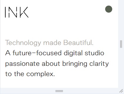
1. INK
The website for INK showcases their focus on clean, modern design, which enhances clarity and user experience. Their minimalist approach and strong emphasis on visual storytelling make complex technology accessible and engaging. The design is intuitive, with smooth navigation, allowing users to easily explore their portfolio. This simplicity reflects the agency’s aesthetic and helps convey a sense of professionalism and focus on quality over quantity.
Got it.
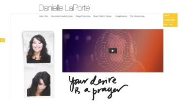
2. Danielle LaPorte
Danielle LaPorte is an inspirational speaker, former think tank exec, and business strategist who writes her thoughts on start-ups and living your passion at DanielleLaPorte.com, where she gets over a million visitors. Her site has been called “the best place on-line for kick-ass spirituality”, and was named one of the “Top 100 Websites for Women” by Forbes. (Thank you, Huff Post, for help with her bio).
If I said I wanted to be her, would you still come back to read my thoughts on growing your blog online? She’s ass-kicking it online, but I don’t know if she’s got kids. Yes, that’s my excuse, and I’m sticking with it until he’s in college.
Danielle’s brand is simple yet exudes what you imagine her personality to be. She knows how to be authentic online, and it’s made her very, very … well off.
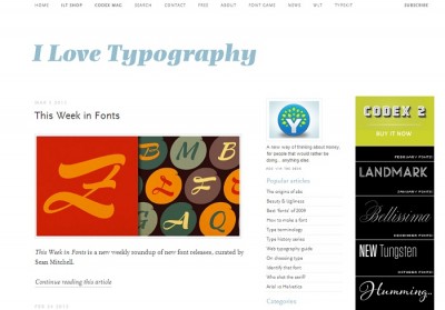
3. I Love Topography
John Boardley is the man behind I Love Topography. He’s also the publisher of Codex, the journal of typography, so it would only stand to reason that he would prefer the simple in design. Just staring at his website makes me feel like the girl in the room in granny underwear.
Is it even possible for me to create a cool brand of myself online? I often think 8WomenDream is only cool because of the other dreamers, especially the younger ones.
I stare at his site and sigh. It’s become a daily habit.
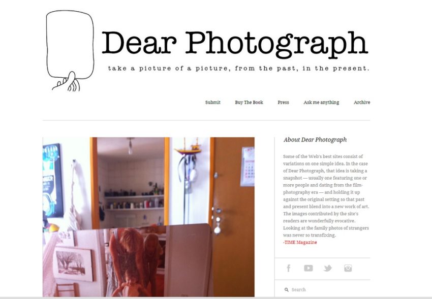
4. Dear Photograph
The epitome of coolness is Taylor Jones’ site, Dear Photograph. His idea was simple: hold up a photograph from the past in front of the place where it was originally taken, take a second photograph, and add a sentence of dedication about what the photograph means to you and upload it to his website.
Millions have converged on his site to share and read-alike. The then-22-year-old Jones started Dear Photograph after flipping through old family photos at his parent’s kitchen table.
22 years old!
It’s such a great idea for a website that staring at it makes me want to just pack my bags and leave the Internet for good. Sometimes, it’s hard to stare at pure brilliance online.
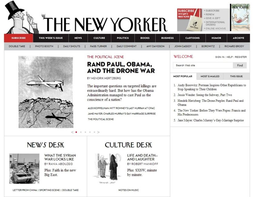
5. The New Yorker
What can I say? It’s the New Yorker.
If you ever want to compare your writing with real writing, read the New Yorker. It will deliver a big dose of humble pie mixed in with “So YOU thought you could write, right?” and sounds of distant laughter. But when I think of an online publication that sets the standard for online publishing, I have to go with the New Yorker.
If you are willing to read 16 pages ONLINE about Scientology while staring at a computer screen, then you understand why the New Yorker hooks its readership.
Of course, the New Yorker is lucky. They can break a few rules online because they already were a brand before going online. They already had class, too. But if you are going to set the bar for your online dream, then you may as well set it very high.
Very high.
Back to the drawing board…
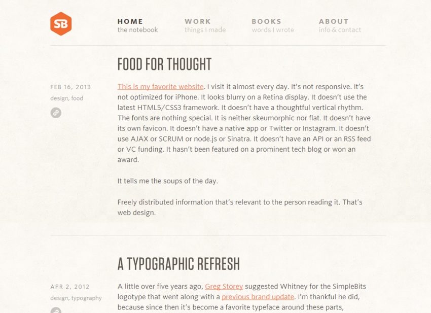
6. Simple Bits
Simplebits is the website of Dan Cederholm, designer, and author of Bulletproof Web Design. To quote him, “Freely distributed information that’s relevant to the person reading it. That’s web design.”
I’d take that one step further and change his last sentence to “That’s the key to online success.”
SimpleBits is also Dan’s “notebook”, where he writes about design, CSS, markup, web standards, craftsmanship, and thoughts on life. It’s a pretty-near-perfect personal brand website.
I like to read what he says about design so I can slap myself upside the head with a “D’oh!” His site can be painful to my head.
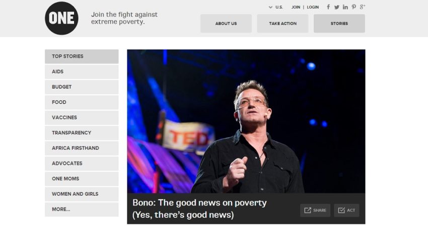
7. One
ONE is the website of a grassroots and advocacy campaign of more than 3 million people committed to the fight against extreme poverty and preventable diseases, particularly in Africa.
Their left sidebar menu says it all. Just when I think I am changing the world, I see how others are REALLY changing the world. Talk about big dreamers. I need a better sidebar.
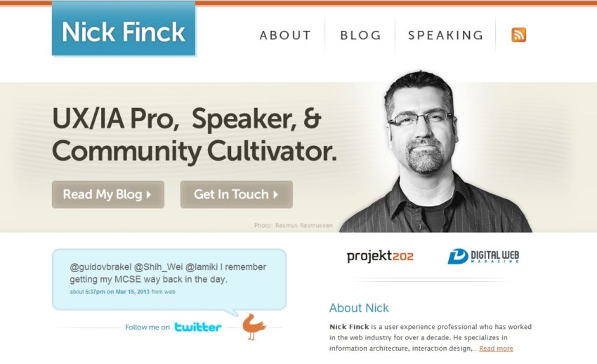
8. Nick Finck
Just in case you don’t know who Nick Finck is, he’s the founder and former publisher of Digital Web Magazine. He has also created web and mobile experiences for Fortune 500 companies, including Adobe, Intel, REI, Boeing, Google, and Oprah.com. Yep. Oprah.
I love what he says about the end-user experience,
“Anyone that has been working in this industry for a while, and has actually been running A/B tests, knows that we’re very often surprised. What we think would happen with a given design or feature doesn’t always work out like that. Unless you have access to the detailed analytics, it’s very possible your intuition is wrong. Mine is wrong so often I have come to expect to be wrong. But I’ve found that helps me much more than it hurts me because I’ve learned to be very open to the data and to learn quickly.”
There is no question who he is when you land on his website. He strikes the perfect design balance. I want to scratch everything whenever I visit his site and start over.
And what did my two weeks get me in design?
TA-DA!
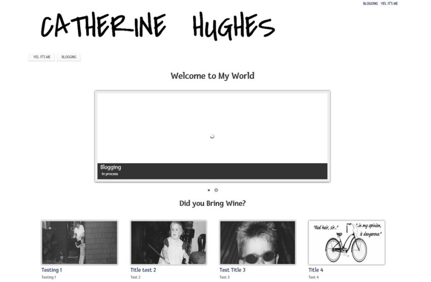
There it is. I birthed another website. It’s only been 10 years in coming, and it’s nowhere near where I want it to be yet. But you have to put it out there. You have to launch your dreams now. Simplicity will also gift you a faster launch time and more time to spend working on your dream.
Even though you should always strive for perfection, you have to launch before you are ready, then tweak and fix, and tweak and fix, until you get feedback — not the type where you are told that what you are doing is great, but the type where people tell you how to improve your experience, how you are missing your mark, what you shouldn’t change, and then they offer assistance. Otherwise, keep working on it.
In the vast ocean of websites and content online, simply give your visitors a place to rest and allow them to focus.
I invite you to welcome the white space into your dream world this week. Consider it your friend. It likes to be called “Simple.”
Say hello from me.

Catherine Hughes is an accomplished magazine columnist, content creator, and published writer with a background as an award-winning mom blogger. She partners with companies to create captivating web content and social media stories and writes compelling human interest pieces for both small and large print publications. Her writing, which celebrates the resilience and achievements of Northern California’s residents, is featured in several magazines. Beyond her professional life, Catherine is passionate about motherhood, her son, close friendships, rugby, and her love for animals.
Note: Articles by Catherine may contain affiliate links and may be compensated if you make a purchase after clicking on an affiliate link.
