Last updated on April 8th, 2012 at 07:59 pm
The jewelry front was quiet this past week with my dream to get my jewelry showcased and sold for one of my multiple  streams of income.
Welcome to the official start of summer.
This time of year refreshes my outlook.
Colors pop up everywhere. I admire the flowers blooming in the front yards of houses and I explore the unusual organic shapes developing from the growth explosion.
This leads me to how I choose where to start on a new jewelry piece.
For me -Â it’s color.
 First I start with the primary color I want to play with.
Do you know about color theory?
The way I approach jewelry lets me step away from the rules and look at shape and texture.
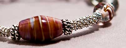
How do the beads play next to each other?
Typically my next step is to find 2+ supporting players.
This can be in the form of beads for the design, spacers, even the type of wire depending on the design.
When I think about the bead colors I pick color with the end result in mind.
What statement do I want to make with this piece?
Strong? Bold? Subtle? Demure?
Then I jump straight into designing. I experiment with different beading colors and shapes, alternating patterns and color until I get the feel of the piece I want to create.
Then I decide on a focal point for the design.
Is it going to be a large central bead that will capture the eye? Will it be a round bead or a shaped bead? Or will I be combining beads to make a larger, more central f ocus?
ocus?
Then I continue to experiment with the texture, color and scale.
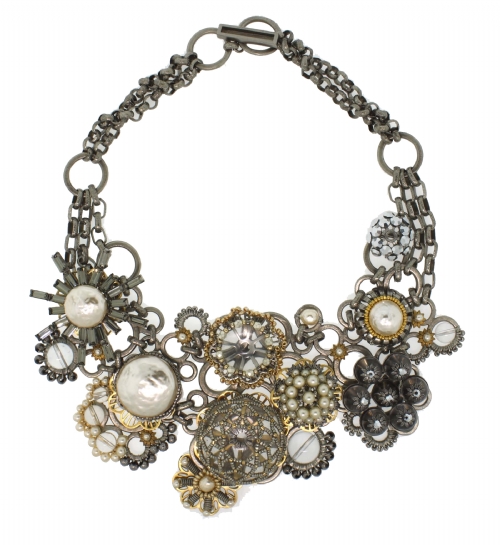
Am I using any metal in this piece? If so, I need to think about the type of metal I want to accent my piece.
When choosing the metal I think about the skin tone of the client I imagine wearing my piece.
Cool skin tones (redheads, pale skin, freckles with a ruddy complexion) favor metals such as silver, platinum, and white gold.
Warm skin tones (brunettes, black hair – people who tan in the summer) favor metals such as gold, pewter, brass, and copper.
Once I decide on the metal, I go back to experimenting with beads and color.
Sometimes I will take into consideration the colors opposite each other on the color wheel. A color wheel can help understand what colors are complementary and contrasting.
If you don’t own a color wheel, there’s www.colorcombos.com, a website with color combination tools and library for web designers and Color Buzz, a blog about colors that can help you with your color inspirations.
Colors on the Web also has all kinds of information on color, along with their Spin the Wheel color picker.
Carefully chosen color combinations enhance jewelry and can become the trademark of a particular jewelry designer. I hope you enjoyed this little window into how I go about my jewelry design.
When we are living our dreams and doing what we love, decisions like colors and textures in jewelry design become a loving quest -Â bringing me great joy.
And this is how our dreams should be. Don’t you think?
Till next week —
Heather
![]() Heather’s dream is to have multiple streams of income, starting with launching an e-commerce website that showcases her one-of-a-kind designer jewelry, which are crafted by her. Heather’s post day is Thursday and her newly launched jewelry site is For Your Adornment. She also writes and lectures about Social media at Design To The Finish Line.
Heather’s dream is to have multiple streams of income, starting with launching an e-commerce website that showcases her one-of-a-kind designer jewelry, which are crafted by her. Heather’s post day is Thursday and her newly launched jewelry site is For Your Adornment. She also writes and lectures about Social media at Design To The Finish Line.

Heather Montgomery is a fitness writer, triathlete, and serial entrepreneur who is devoted to sharing what she has learned about becoming a triathlete after age 40. She uses her Metabolic Training Certification to help other women struggling to get fit in mid-life. She lives and trains in Santa Rosa, California, the new home of the Ironman triathlon. You can find her biking the Sonoma County wine trails.
Note: Articles by Heather may contain affiliate links and will be compensated if you make a purchase after clicking on an affiliate link.


